

100
YEARS
OF
PAUL RAND
In August 2014 Paul Rand would have been One Hundred Years Old.

"Design is so simple, that is why it is so complicated."


Paul Rand was one of the worlds most influential and talented graphic designers of our time. His amazing work with IBM, UPS and NeXT has been seen as iconic and admirable even to this day. His outstanding career spanned over six decades starting as early as the 1930's when he was still a teenager. By the time he was in his twenties, Rand had made quite an impact on book, magazine, advertising and package design. As one of the originators of the Swiss Style within graphic design, this style is used heavily within a lot of his work and has been adapted by many designers since. Rand was one of the reasons that the radical ideas of De Stijl, Russian Constructivism and the Bauhaus were brought into American commercial art and design.
He was able to develop his own skills and learn from his students when he taught design at Yale University in New Haven for over two decades. It was here that he was able to spread his design techniques and inspirations to young aspiring designers that admired him. Paul Rand was born in 1914 as Peretz Rosebvaum to an Orthodox Jewish family. Given his religious background and the Jewish laws forbidding the creation of images, his career in creating icons seemed like something that could never happen. Although the idea of art and design was embraced whilst he was a young boy where he was able to paint signs for his father's store.
His artistic flare was then heightened by his interest in comic strips that he read which included Nell Brinkley's comic women in the New York World and "Krazy Kat" by George Herriman. As well as his religious beliefs, Rand's father did not consider the design field a substantial career for his son. This lack of support from his father made him want to get into the industry more than ever and did so through hard work and determination
Although his father did not agree with his son's potential future career choice, he did pay the entrance fee for Pratt Institute so Rand could attend night classes in order to fulfill his aspiration to become a designer. However these classes and the teachers did not provide him with the stimulation that he needed. Rand was pretty much a designer that was self-taught. He spent a lot of his time in the art section of the New York Public Library, learning from piles of art books and magazines. It was here that he came across Gebrausgraphik, a German advertising arts magazine that introduced him to the works of Cassandre and Moholy-Nagy.


Rand's career started in the early 1930's where along with his school assignments, he took on a part-time job creating stock images for various newspapers and magazines. Through this job he was able to demonstrate and develop some of his skills. During this time he also enrolled himself into a drawing class at the Art students League in Manhattan, taught by Gerg Grosz. Rand was able to create a fairly large portfolio in his spare time between work and his education, using what he had created and learnt. He knew that the work itself would not guarantee a position, and so he decided to change his name to conceal his overly Jewish Identity, from Peretz Rosenbaum to Paul Rand. In a way, it was a persona that he created. One of Rand's friends; Morris Wyszogrod, noted that "he figured that 'Paul Rand,' four letters here, four letters there, would create a nice symbol. So he became Paul Rand."
While he was a student, Rand was very much influenced by the German poster style known as Sachplakat. He admired Gustav Jensen, who was one of the leading designers that specialised in Sachplakat at the time. A lot of Rands early illustrative work was heavily influenced by Jensen, Rand even offered to work for Jensen completely unpaid just so he could learn from him.
Rand's career started to bud when he was in a meeting with designer Ervin Metzl that led Rand to being introduced to advertising and package designer, Joe Switzer. Rand was hired by Switzer to do newspaper ads for $10 per week. From his earnings, Rand was finally able to open a small studio where he collected freelance layout work from Glass Packer magazine. Rand’s reputation began in 1936 when he was given a job with Apparel Arts Magazine to create a page layout for their anniversary issue. After completing this project his talents where made very evident. His skills in transforming basic photographs into amazing compositions and layouts proved he had something special which resulted in him getting a full time job with the magazine. His witty and humours style combined with creativity was something was completely unheard of on the newspaper and magazine shelves. It was this distinctive look and feel that Rand created for the magazine that landed him with an offer as an art director for the New York office of Esquire-Coronet. It took Rand an entire year to accept the job because he insisted that he wasn't artistically ready for the job. At the age of twenty-three, Rand took on this responsibility and was even put in charge of certain sections of the magazine, particularly the fashion section.

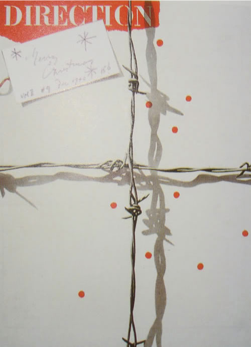
A big stepping stone in the development for what we know as the Paul Rand style, was the cover art that he created for Direction Magazine. In 1938, publisher of Direction magazine Marguerite Trader Harris approached Rand and asked him to design a few covers for her magazine. As a payment, Rand was offered complete creative freedom in place of money. Rand took up on her offer and from 1938 to 1941 he took the magazine into unexplored areas of graphic design. One of his most iconic covers was the 1940 christmas cover which reflected on Nazi-occupied Europe at the time. The cover incorporated a piece of barbed wire that crossed the cover that a ribbon on a box, along with red lots that represented blood droplets and a gift tag, this cover pushed the limits of graphic design to new levels. It was through this that Rand was able to develop, experiment and expand his design techniques which refined his style and allowed him to create the works we know him best for. According to graphic designer Louis Danziger:

"He almost singlehandedly convinced business that design was an effective tool. Anyone designing in the 1950s and 1960s owed much to Rand, who largely made it possible for us to work. He more than anyone else made the profession reputable. We went from being commercial artists to being graphic designers largely on his merits."-Louis Danziger
It was in 1941 at the age of twenty seven that Rand became an art director for the Weintraub Agency. This opportunity came about when William Weintraub, a partner of Esquire-Coronet, left to set up his own advertising agency and Rand decided to join. The agency went on to be the first "Jewish agency" that had acquired a reputable client list that included the likes of Revlon and Emerson Radios. The company grew considerably within a year. Rand usually took a step step and did not delegate to the staff very often. Although there were staff available, Rand generally preferred to design the work himself without the help of others.
Rand was one of the driving forces behind modernising the way in which adverts were created. Before the 1940's, most adverts were created by a printer instead of being designed by a designer. Rand believed that people working within the creative industry needed to join together when creating work instead of companies being split up into different sections. Rand was the one responsible for influencing William Bernbach at Weintraub to create "creative teams" that joined art directors and copywriters together in order to make the end design more effective.
By 1946, Rand was starting to build quite a good reputation among the design industry. This was the year that he decided to write the first of four books about his work and ideas within design. “Thoughts on Design” was published by Wittenborn Books and was a book that not only gave an overview of his work and designs but also to teach the reader about certain principles around advertising design. By incorporating images of work that he created, the book clearly identifies the certain principles within design and Rand uses his work to explain the princess further.
Rand delved into art education once again after a meeting with Moholy-Nagy that made him realise that he had much more to learn.
"I started reading because of a remark of Moholy-Nag... I remember, Moholy asked me, "Do you read art criticism?" And I said, "No." The only thing he said was, "Pity."- Interview of with Steven Heller 1988
Rand soon became an avid reader, taking in as much information as he could and then projecting what he had learnt onto his designs. Although he believed that one learns best from practise, he soon learnt that you cannot practise what you do not know about. His own library contained many books that he would refer to often to keep the ideas and principles fresh in his mind. Some of his principles of design have been taken and quoted from books that he read and then incorporated into his own writings. During the 1950's, Rand began to introduce these design theories and principles to his students at Yale.
During 1956, Rand was hired by Eliot Noves, the new appointed director for International Business Machines (IBM). Loves hired Rand because he felt that IBM looked outdated and needed a serious revamp and knew that Rand was the man for the job. Rand came in and did exactly that, he redesigned everything from the iconic logo to their packaging. Rand's redesign of the IBM is one of his most well known and iconic designs, the design reflects on how the company changes not only on the face of it but also in their profits. The logo is famous around the world due to its simplicity, although it is similar to the previous logs, it projects a stronger corporate image whilst including colours instead of the black it was previously. The horizontal lines within the logo can be seen as representing the dynamism and goodwill of the company. Along with the capitalised lettering which illustrates authority and presence which is exactly what the IBM wanted to.
Paul rand was an admirable designer who pushed and stretched design to its limits, taking it to areas the world had never seen before. As he once said during an interview with George Lois in 1986, "I had the courage or the audacity or the stupidity to take a chance. I didn't know what the hell would happen.". He was a talented man who painted, taught and designed from the knowledge that he acquired from reading combined with his remarkable creativity. Rand was different from other designers in that he not only cared about how the final design looked, but he really cared about design in terms of its need and function. Through Rand's radical outlook and process of design, he transformed it to what we know it as today. No matter who or what got in his way, he never deferred from his goal to change design and to make it known for its importance in our lives, and that is something we all have to thank Paul Rand for.
Over his lifetime Paul Rand has created some of the most well known logos known to the design industry. One of the most famous of these logos was the IBM logo that he designed during the 1960s. The logo was based on the original three-letter logo, this then developed into thirteen horizontal bars that was then developed further into eight horizontal bars. The idea of incorporating the horizontal bars was to give the logo a lighter look as well as giving it a more unique design. The logo itself does not give illustrate what the company actually does apart from portraying a message of dynamism. The design was so successful that illustrating what IBM was not needed because the logo became so recognisable that everyone knew who IBM were.
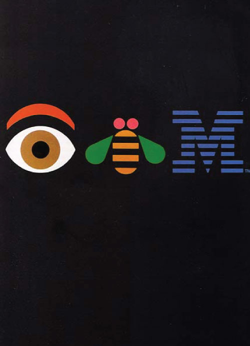
Paul Rand not only redesigned the logo but also created numerous posters that were used for advertising for the company and motivating the staff. One of most successful posters was the 1981 Eye-Bee-M poster in support of IBMs motto “Think”. The poster was in the form of a word puzzle also known as a rebus. The poster incorporated illustrations to represent the letters, the ‘I’ being represented by an eyeball and the ‘B’ represented by bee. The poster proved to be a massive hit and various designed have attempted to recreate their own posters in this style for years since.
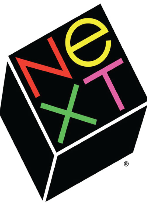
During the late 1980s Paul Rand was hired by Steve Jobs of Apple Inc. to make a logo for his company ‘NeXT’. The logo was cleverly designed into a cube shape to replicate the products that the company created. Rand used bright colours of yellow, red, green and fuchsia on a black background so that they would pop with the contrast.
In conclusion, Paul Rand was one of the world’s most inspiring graphic designers and still to this day is considered a master of design. He contributed to the design industry in a way that nobody could ever compete with by helping to make design known as a professional job and not just a hobby. He developed guidelines and structure for future graphic designs to follow in order to be innovative and creative.
Reference
Logodesignlove.com, (2008). All about designer Paul Rand | Logo Design Love. [online] Available at: http://www.logodesignlove.com/all-about-paul-rand [Accessed Dec. 2014].
Areaofdesign.com, (n.d.). Paul Rand | American Icons | Area of Design. [online] Available at: http://www.areaofdesign.com/americanicons/rand.htm [Accessed Dec. 2014].
Paul-rand.com, (n.d.). Biography | Paul Rand, American Modernist (1914-1996). [online] Available at: http://www.paul-rand.com/foundation/biography [Accessed Dec. 2014].
Wikipedia, (n.d.). Paul Rand. [online] Available at: http://en.wikipedia.org/wiki/Paul_Rand [Accessed Dec. 2014].
Book - Thoughts on Design - Paul Rand
Book- From Lascaux to Brooklyn - Paul Rand
Book- A Designer's Art - Paul Rand